The CSS border-radius property is used to round the corners of the outer border edges of an HTML element or tag. This feature allows you to completely round the corners of the elements. This feature can be used for elements to which a CSS border can be added, such as div and etc.
This feature can only be used in browsers that do not use WebKit as their web engine. Today, almost all browsers support this feature, but for use in old browsers, you can use -moz-border-radius or -webkit-border-radius.
The border-radius attribute in CSS can contain one, two, three, or four values. This property can accept any valid CSS value like px, rem, em, ch, vh, vw, etc. Even these values can be percentages. The second set of values can optionally be entered with a slash (/). Slashes are only supported in Gecko 2.0 (Firefox 4.0).
| Default value: | 0 |
| Inherited: | no |
| Animatable: | yes |
| Version: | CSS3 |
| JavaScript syntax: | object.style.borderRadius="25px" |
Let’s see what happens when we provide a single value, two values, three values, and four values to this property.
Single value
border-radius: 15px;Two value
border-radius: 15px 30px;Three value
border-radius: 15px 30px 5px;Four value
border-radius: 15px 30px 5px 0;Now let’s see what happens when we provide a percentage value, / to this property and how to create a circle in CSS with the border-radius property.
We can specify separate horizontal and vertical values by using the slash (/) symbol. The values before the slash (/) are used for the horizontal radius and the values after the slash (/) are for the vertical radius.
In other words, the rounding doesn’t have to be perfectly circular, it can be elliptical. This is done using a slash (/) between two values
Percentage
border-radius: 15%;/
border-radius: 30px/20px;Circle
border-radius: 100%;Length
Shows the size of the radius of the circle or semi-major and semi-minor axes of the ellipse using length values. Negative values are invalid.
Percentage
Shows the size of the radius of the circle or the semi-major and minor axes of the ellipse using percentage values. The percentage for the horizontal axis refers to the width of the box. The percentage for the vertical axis refers to the height of the box. Negative values are invalid.
CSS border-radius values
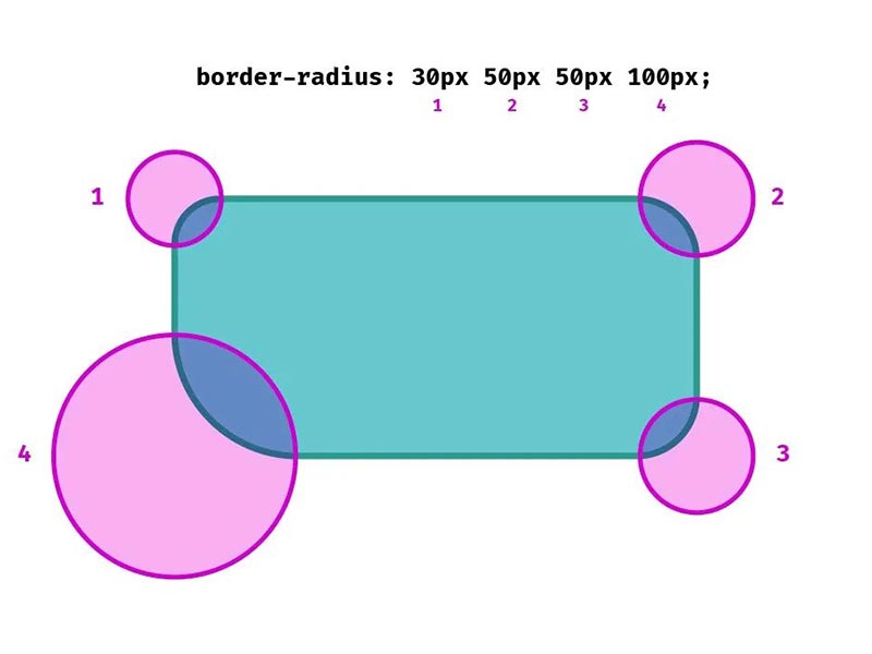
The border-radius property takes between one and four length or percentage values, where one value sets the radius for all four corners at once, while four sets each individual corner.
Four values are given for each radius, respectively, top-left, top-right, bottom-right, and bottom-left. If the bottom-left is removed, its value will be the same as the top-right. If the bottom-right is removed, the value will be the same as the top-left. If the top-right is removed, the value will be the same as the top-left.
1. border-radius: 15px
All top-left, top-right, bottom-right, and bottom-left values are 15px.
2. border-radius: 15px 30px
The top-left and bottom-right values are 15px and the top-right and bottom-left values are 30px.
3. border-radius: 15px 30px 5px
The top-left value is 15px, the top-right and bottom-left value is 30px, and the bottom-right value is 5px.
4. border-radius: 15px 30px 5px 0
The value of the top-left is 15px, top-right is 30px, bottom-right is 5px and bottom-left is 0. The order of these values is clockwise.
CSS border-radius shorthand
The CSS border-radius property has the shorthand feature. This means that we can define the shape of each corner of the elements separately.
border-top-left-radiusborder-top-right-radiusborder-bottom-right-radiusborder-bottom-left-radius
This feature allows us to change the curvature size of any corner of the element or tag as needed.
border-top-left-radius: 30px;As with any shorthand property, individual sub-properties cannot inherit, which would partially override existing definitions. Instead, individual longhand properties have to be used.
.hs-border{
    border-radius: 30px;
}
.
.
.
.
.hs-border{
    border-radius: 5px 5px inherit inherit;
}
The second border-radius will be omitted and doesn’t work.
Browser support
The numbers in the table indicate the first browser version that fully supports the border-radius feature.
Numbers following -webkit– or -moz- indicate the first version that worked with the prefix.
| Fire Fox | Chrome | Edge | IE | Opera | Safari | Chrome Android | Firefox for Android | Opera Android | Safari on iOS |
| 4.0 3.0 -moz- | 5.0 4.0 -webkit- | 9.0 | 9.0 | 10.5 | 5.0 3.1 -webkit- | 18.0 | 4.0 -moz- | 11.0 | 4.2 |
Although it’s unnecessary nowadays, for the best possible browser support, you can prefix this feature with -webkit- and -moz- to make sure older browsers can support it:
-webkit-border-top-left-radius: 1px;
  -webkit-border-top-right-radius: 2px;
  -webkit-border-bottom-right-radius: 3px;
  -webkit-border-bottom-left-radius: 4px;

  -moz-border-radius-topleft: 1px;
  -moz-border-radius-topright: 2px;
  -moz-border-radius-bottomright: 3px;
  -moz-border-radius-bottomleft: 4px;

  border-top-left-radius: 1px;
  border-top-right-radius: 2px;
  border-bottom-right-radius: 3px;
  border-bottom-left-radius: 4px;
Border-radius in Bootstrap
Almost every CSS frameworks have classes to manage border and border-radius. Bootstrap is a popular framework that you can manage border-radius with its classes that are provided for you.
<span class="rounded"></span>
<span class="rounded-top"></span>
<span class="rounded-right"></span>
<span class="rounded-bottom"></span>
<span class="rounded-left"></span>
<span class="rounded-circle"></span>
<span class="rounded-0"></span>
This class adds 0.25rem to the element’s corners. For example, in the above examples, the rounded class adds value to the specified corner.
The rounded class adds 0.25rem to every corner. The rounded-circle makes the element circle (border-radius: 100%) and rounded-0 removes the radius.
Border-radius in Tailwind
Tailwind like Bootstrap is a framework. Tailwind has great classes for adding border-radius to the layout.
<span class="rounded"></span>                   border-radius: 0.25rem;
<span class="rounded-none"></span>         border-radius: 0px;
<span class="rounded-sm"></span>             border-radius: 0.125rem;
<span class="rounded-md"></span>            border-radius: 0.375rem;
<span class="rounded-lg"></span>              border-radius: 0.5rem;
<span class="rounded-xl"></span>               border-radius: 0.75rem;
<span class="rounded-2xl"></span>             border-radius: 1rem;
<span class="rounded-3xl"></span>             border-radius: 1.5rem;
<span class="rounded-full"></span>            border-radius: 9999px;
Border-radius property examples and tricks
How to create a circular image with CSS?
Creating a circle image can be done by border-radius with a percentage value.
img{
    width: 100px;
    height: 100px;
    border: 3px solid #fff;
    box-shadow: #333 0 0 10px;
    border-radius: 100%;
}
Note that for better performance your image should be square (width = height) and the value of the border-radius should be the percentage. You can use px or other units but you have to value it so big like 500px.
Button Design by border-radius
Change style of the button and border-radius in mouse hover.
<style>
    button{
        color: #fff;
        background: #00ff00;
        padding: 10px 15px;
        border: 1px solid #333;
        cursor: pointer;
        transition: 0.3s;
        border-radius: 15px 30px;
    }

    button:hover{
        color: #333;
        background: #fff;
        border-color: #00ff00;
        border-radius: 30px 15px;
    }
</style>
<button>Submit</button>Border radius bleed
Let’s assume that you want to create a rounded cart with an image.
<style>
    .cart{
        background: #333;
        border-radius: 15px;
        padding: 0 0 15px 0;
        width: 300px;
    }

    .cart img{
        max-width: 100%;
    }

    .cart h2{
        padding: 0 15px;
        color: #fff;
    }
</style>
<div class="cart">
    <img src="https://honarsystems.com/wp-content/uploads/2022/10/wordpress-backup.webp" />
    <h2>Title</h2>
</div>
Title
In this example, the image in the cart is not rounded. To round, the image simply adds overflow: hidden in cart or border-radius: 15px in image style.
.cart{
        background: #333;
        border-radius: 15px;
        padding: 0 0 15px 0;
        width: 300px;
        overflow: hidden;
    }